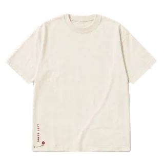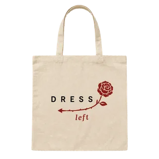
Every printed shirt you own got its image one of three ways, and the three age very differently. You can usually tell them apart with a fingernail and a good light, which is worth ten minutes at a merch table before you spend thirty dollars.
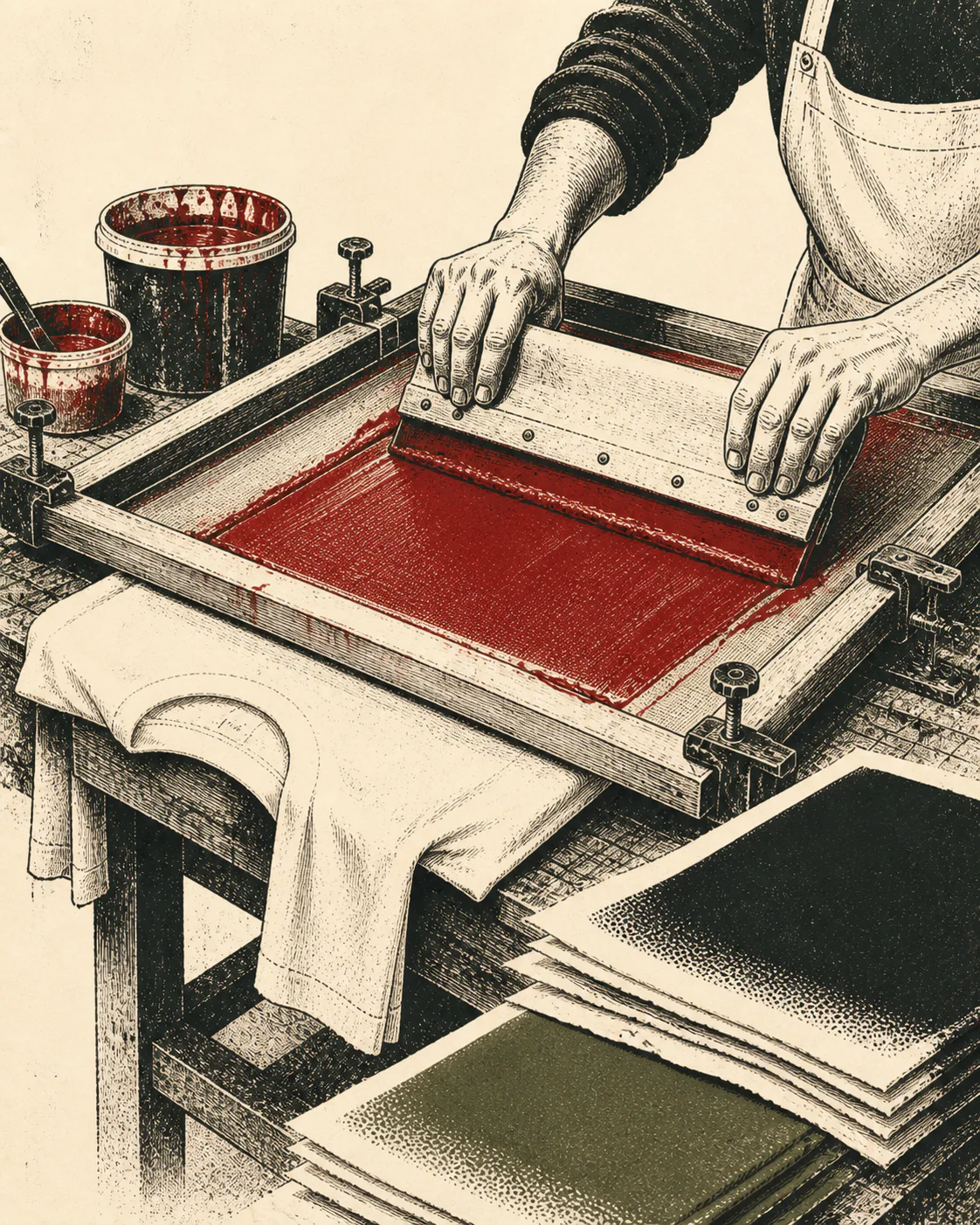
Screen printing is the old workhorse and still the gold standard for bold graphics. A mesh screen is coated, exposed, and washed out so open areas remain in the shape of the design, one screen per color. Ink gets pushed through with a squeegee and cured with heat. The result is a dense, even layer bonded to the knit, which is why a properly cured screen print survives decades of laundry; band tees from the eighties are still legible on their third owners. The economics want quantity, since every color means another screen to make and register, and that setup cost is the same whether you print ten shirts or a thousand. This is why proven designs get screen printed and experiments usually don’t.
DTG, direct-to-garment, is an inkjet printer built for fabric. Water-based inks spray straight into the cotton, so gradients and photographic detail reproduce the way they would on paper, and printing one single shirt costs the same per shirt as printing fifty. The hand is the softest of the three, effectively nothing. The trades: color sits less densely than screen ink, brights on dark fabric depend on a white underbase, and the image fades gradually over years of washing rather than holding like a screen print.
DTF, direct-to-film, is the newest of the three and the one that took over small-batch printing. The design prints onto a release film, gets dusted with adhesive powder, cures, and is heat-pressed onto the garment. No screens, no minimums, no color-count limits, and it bonds to fabrics DTG struggles with. The image sits as a thin film on top of the knit; you can feel its edge with a fingernail. Done well, on a good press with proper cure times, it wears respectably. Done fast and cheap, it’s the print that cracks and peels in a season, and unfortunately both look identical on day one.
Method should follow design. Flat, bold, two-color graphics, a rose for instance, deserve screens and repay them with decades of life. Photographic art belongs to DTG. DTF earns its keep on small runs, tests, and placements a screen cannot reach.
None of the three is a mark of virtue on its own, which is why a brand insisting on one of them everywhere is usually describing its equipment rather than your garment. The narrower question is the useful one: which method went on this specific piece, and why that one rather than the other two. Our product pages answer it in the details panel, on every piece, including the tote.